Back arrow icon

Client

Bohus

Project

Visual identity

Impact

  • Identity implemented across network

Skills & services

Brand identitySignage & wayfindingConcept developmentInstore communicationBespoke typefacesWeb design
Bohus is the largest nationwide home interior retailer in Norway, featuring more than 60 stores spanning the entire country. Competition is fierce, and to be able to compete with industry giants like IKEA, Bohus needed a stronger and more differentiated position in the market.
Motion by Alistair Cheyne at Motion Division
Typeface by Samuelstype
Motion by Alistair Cheyne at Motion Division
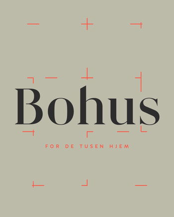
In collaberation with Samuelstype, we designed a set of bespoke typefaces for Bohus, based on the new logotype we created. The 30° angle is the main brand characteristic of the typefaces.
Building on the core values of Bohus (personal, inspiring and trustworthy), we identified an opportunity for Bohus to clarify and communicate its position as the most inviting and personal competitor. Present all across the country, and inviting all customers without exception to inspire and help people to find their own personal style, thus creating inviting and personal quality homes.
With the design program as the foundation, we developed a complete brand and communication program for Bohus, including applications for everything from Web and print to icons, in-store communications, product and price information and facades.
Icons for navigating the physical and digital Bohus store.
Bohus “for de tusen hjem” (for the thousands of homes) is a phrase from the Norwegian national anthem and present verbally and visually across the identity and design program.
We have written a series of warnings for those who are thinking of upgrading their home because there may arise some outcomes that you did not anticipate.