Made in Norway for China. Now, that feels good!
Back arrow icon

Client

Arctic Pharma

Project

Visual identity & packaging

Skills & services

Brand identityPackaging design
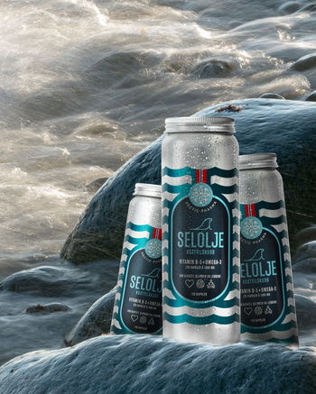
Arctic Pharma offers food supplements made with ingredients from arctic fauna and flora. Pure, raw and made in Norway. Reactor developed a brand identity including logo, color program, icons and labels. These are products made for an international audience, but the Norwegian language are always at the face of the label. The logo and icons are therefore made to be read and understood in all languages.
In food supplements, being a Norwegian product is a competitive advantage, especially in the Asian markets. Therefore the word Norwegian and the national banner reference is given a focal position on the product packaging and on the Arctic Pharma home page. In addition, the original Norwegian language is kept on the packaging, to further enhance the authenticity of the product. Instead, a QR code is used to convenient access to product info in local languages.
What the supply is made from, and what it is good for.
Arctic C+ from cherries, cloudberries and cranberries.
These are the two first products in the Arctic Pharma series. To be continued...