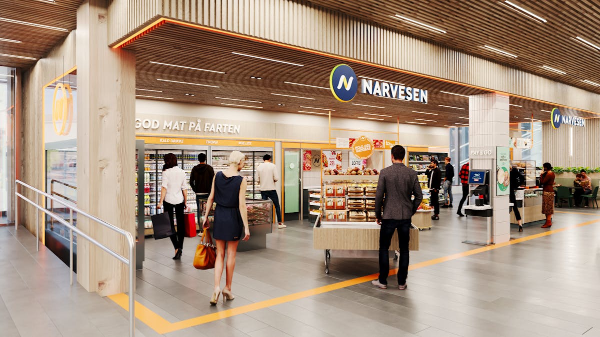

Our work with Reitan Convenience Norway resulted in a revitalization of the brand, laying the foundation for several changes - from signage, store concept, and in-store communication.
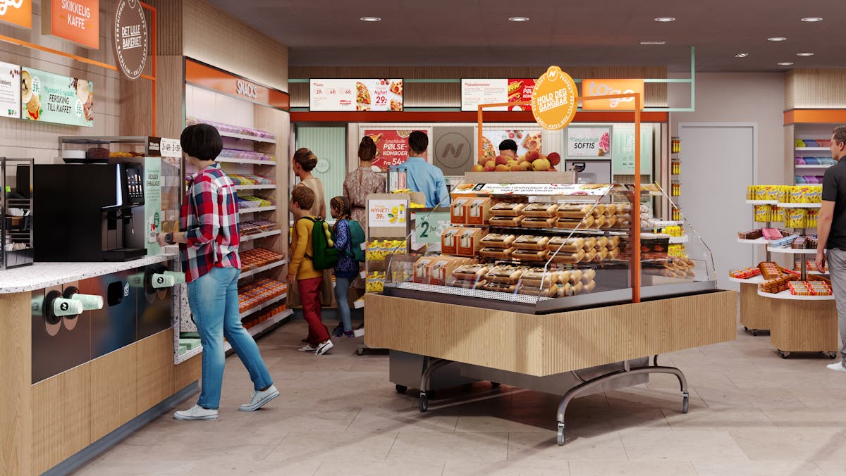
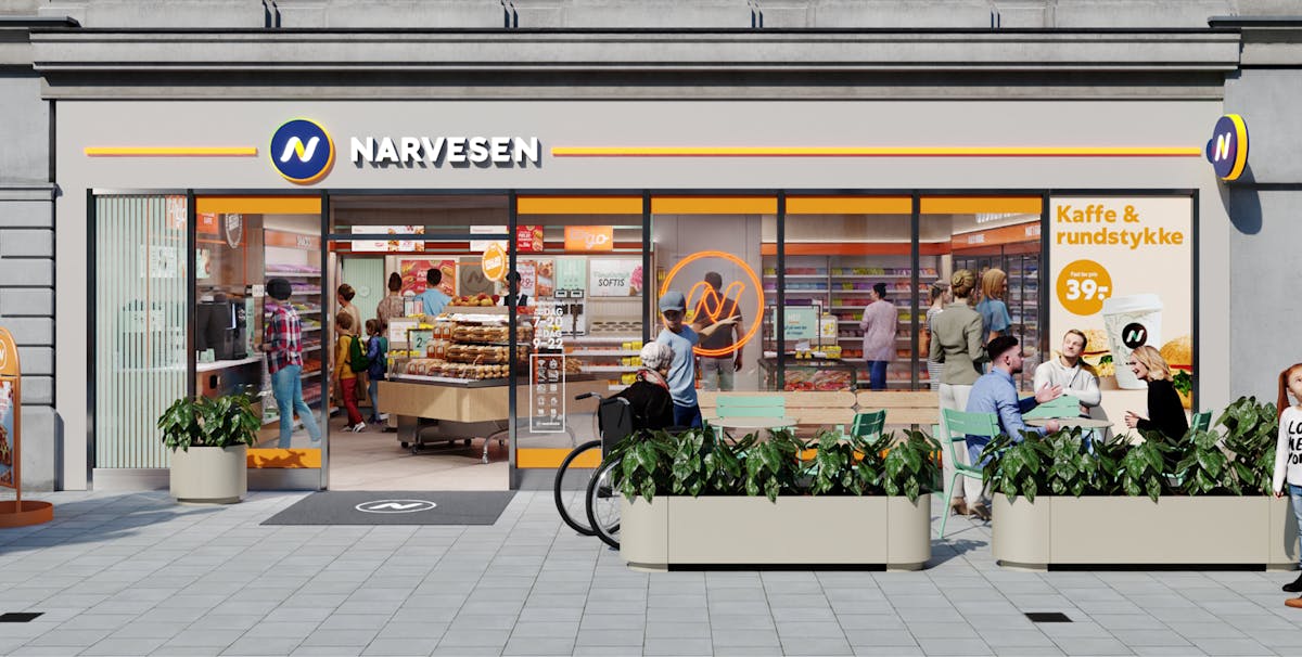
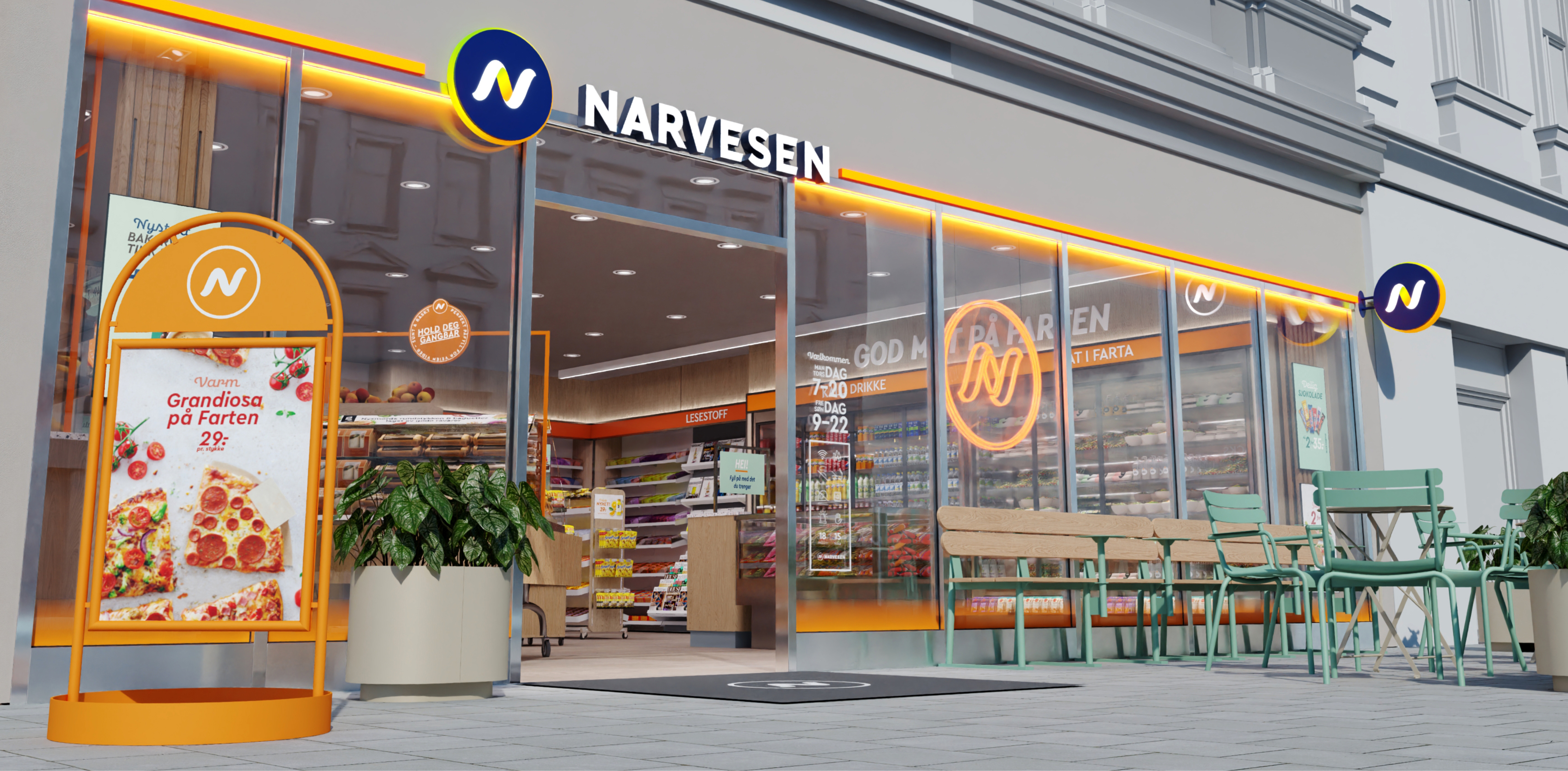
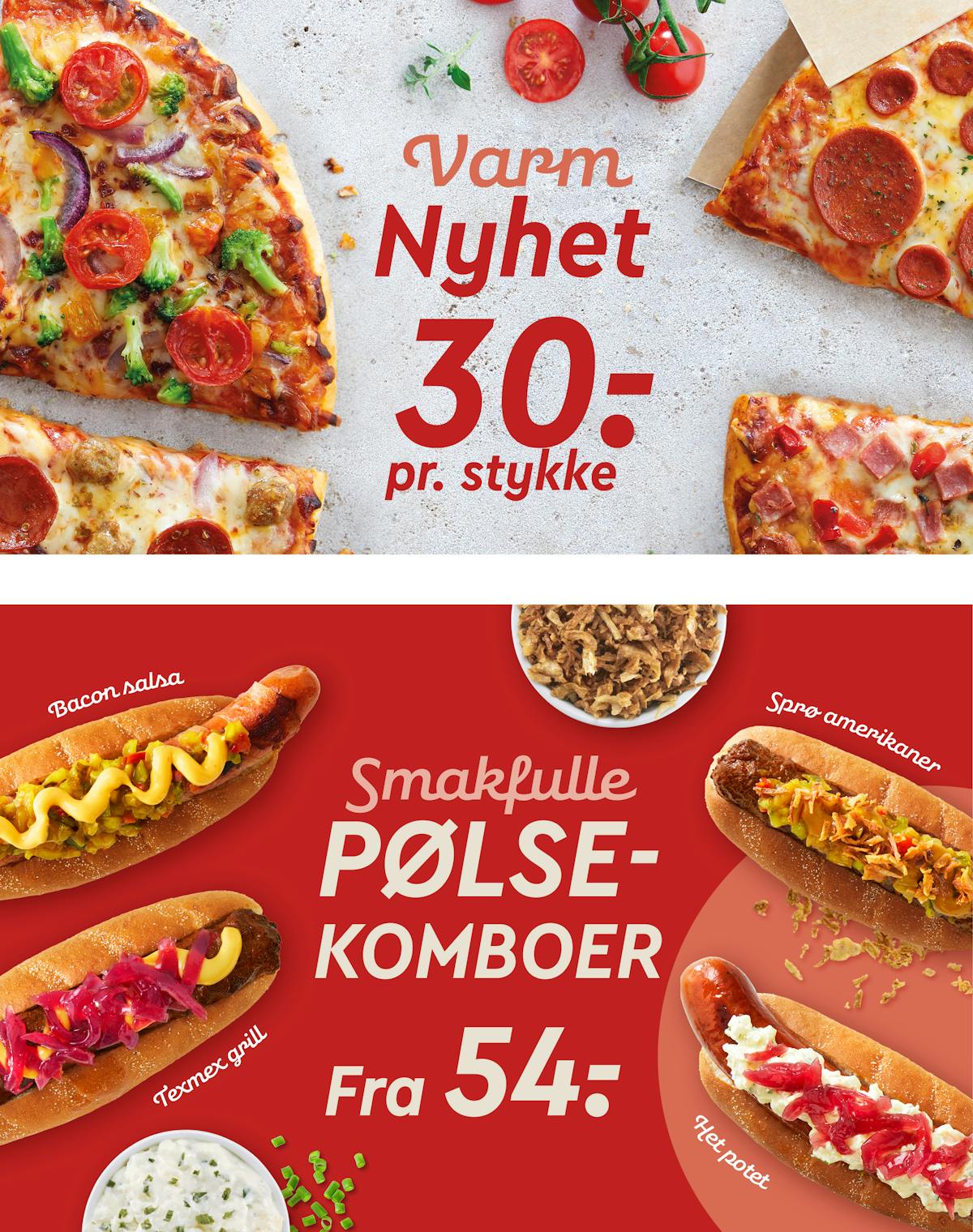
As the customers are always on the go and in a hurry, we wanted the store concept to signal speed and energy. In the old concept, we have moved away from the traditional dark blue color and rainbow spectrum. For the new concept, we created a signature look and brand color highlighting Narvesen and elevating its brand essence as a fast kiosk alternative on the go, making them stand out in the urban environment and visible from a distance.
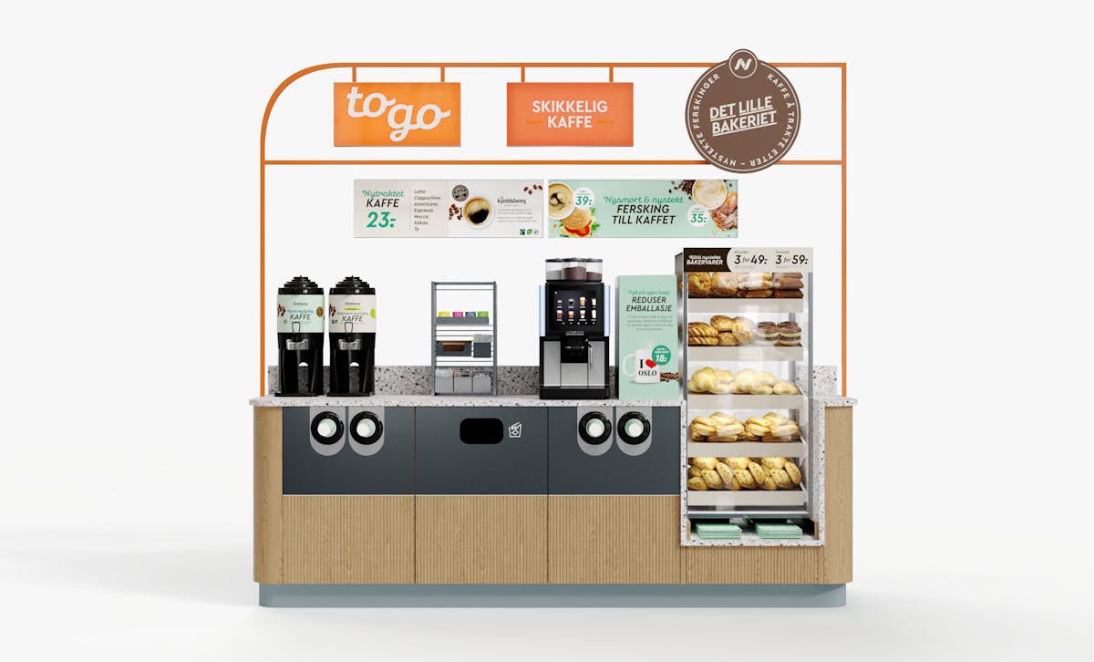
Implementing an orange LED line and foil tape to the facade makes the brand stand out in an urban space. Tying the facade together creates a more significant external footprint but still appears as transparent and inviting as possible. The primary logo guides the customer and highlights the entrance. Flag signs are placed for the best possible exposure to the most critical lines of sight, and a pending LED symbol adds attention to big facade windows.