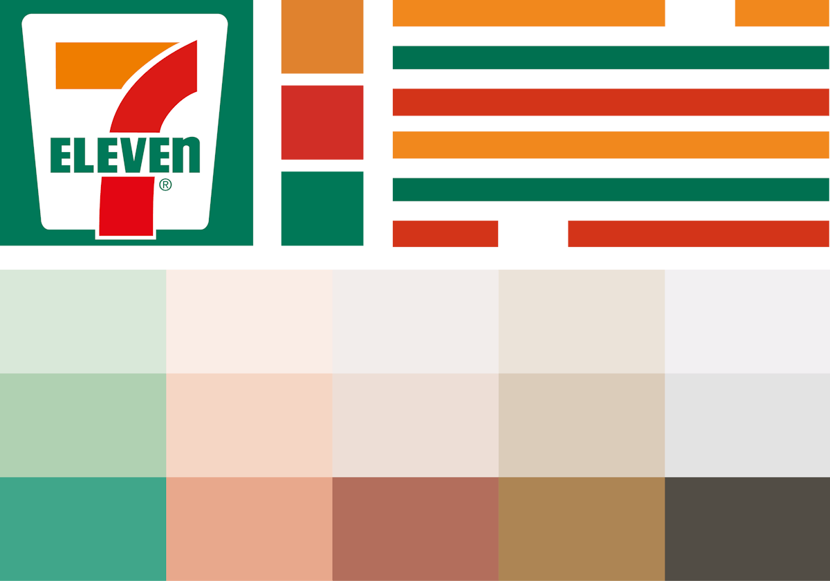
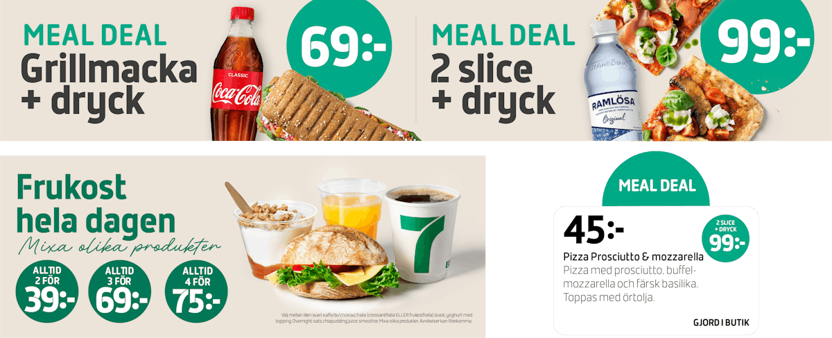
A clear communication hierarchy and updated color palette have been set up to strengthen the various categories.
Motion design by Visual Art
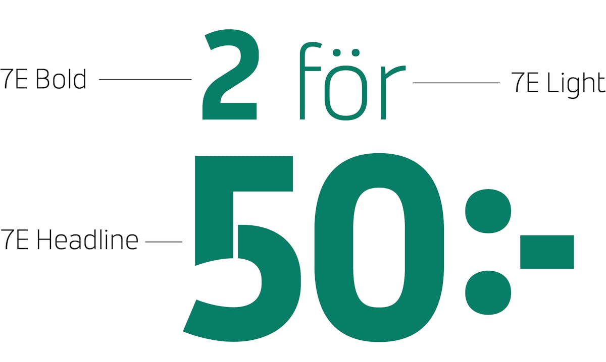
In our work, we have designed the 7E-font family, a font made just for 7-Eleven! The font family consists of 3 weights and a rounded variant.
The header typeface carries the characteristic gap in the letters taken from the ”7” in the logo.
Typeface by Samuelstype
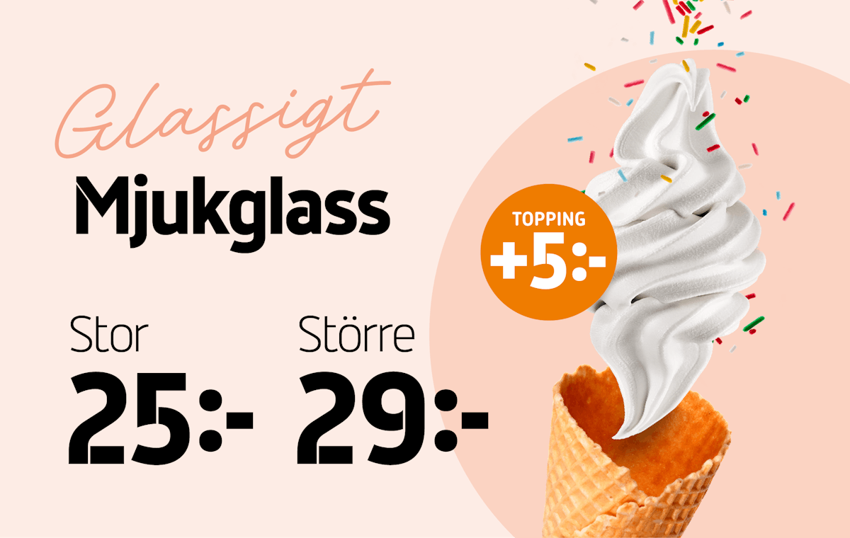
Together with a characteristic script, a clear character and personality have been created, making the communication recognizable in both in-store and external communication.
Motion design by Visual Art
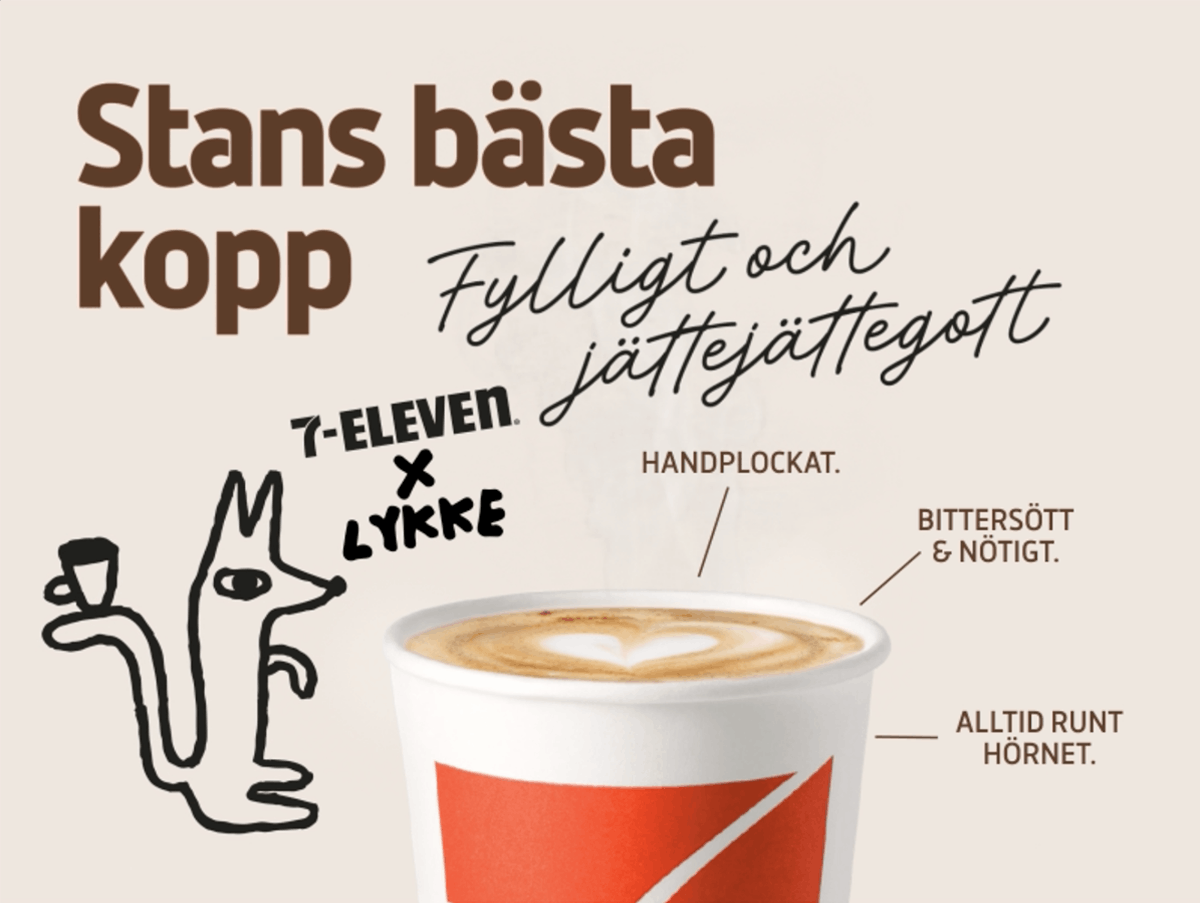
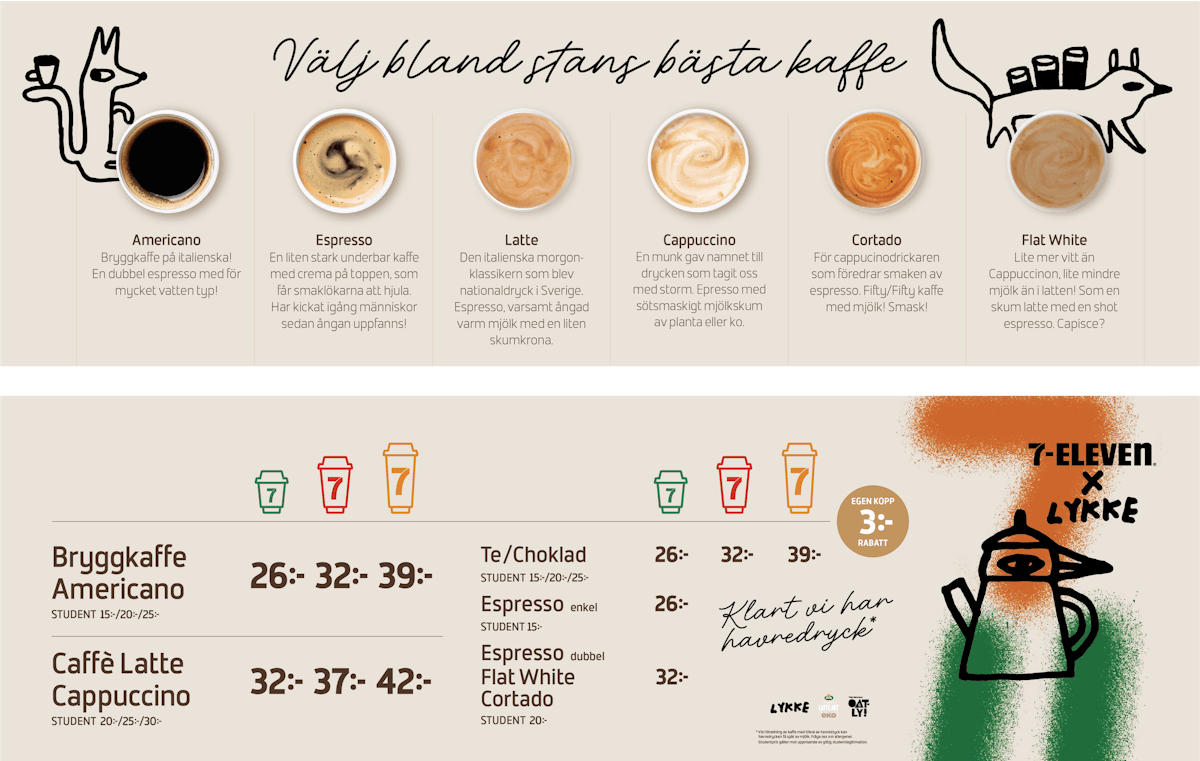
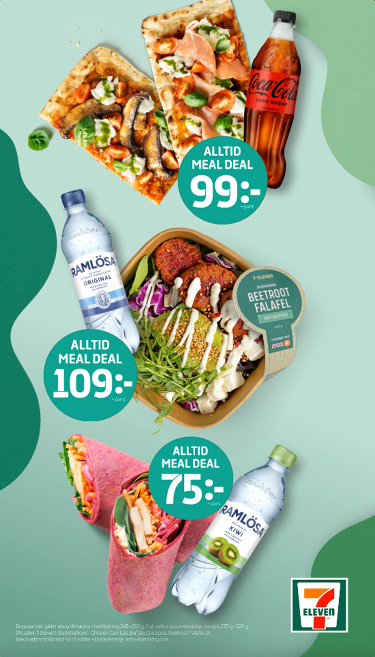
Making it easier for consumers to find what they are looking for, highlighting the products and deals in the best way, and communicating the strategically important categories of food, baked goods, and coffee.